App Analytics: How to read a retention graph
Originally published on the Digital Analytics Blog on Wednesay, April 13, 2016 by Bernard Segarra, Editorial manager at AT Internet
If you have a mobile application, you know the efforts that go toward engaging and retaining your users are considerable. Therefore, your investments must be profitable over the long term. If your visitors love your application, they’ll use it many times over a certain period (and ideally this period goes for as long as possible…). To measure their engagement over time, look no further than the retention graph.
Why measure your apps’ engagement capabilities?
A mobile app’s success can be blindingly impressive if we only look at certain metrics (like the app download rate, for example). But downloading an app and leaving it on your phone doesn’t mean you’re using it regularly.
To study a mobile app’s life cycle, it’s interesting to study the retention rate over an observational period that’s relatively long (several days or weeks) and then segment your data into several different visitor cohorts.
How is retention rate calculated?
According to “traditional” calculation methods, the retention rate corresponds to the proportion of users who came back to an application on a given day (without taking into account any potential interactions between the user and this application before this specific day). There are other calculation methods (like “full retention”, “rolling retention”, “return retention”, among others) which we won’t go into here. The “traditional” method is the most widespread and gives a good idea of the application’s overall retentive abilities.
Enter the Matrix…
With the retention graph (also called a retention matrix), you can compare different populations at a glance.
Choose the appropriate granularity (day or week) and study recurring usage. You’ll be able to evaluate the impact of a specific factor in particular (such as a campaign, an event, exposure to content, etc.) on application use.
Good to know…
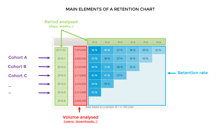
To read a retention graph, it’s important to understand that the time-related element (the period analysed) is represented horizontally as well as vertically. Here’s an overview of the main elements to understand:
Let’s take an example…
In the following retention graph, we can analyse a period of 6 weeks, during which different user cohorts downloaded and launched an application for the first time.
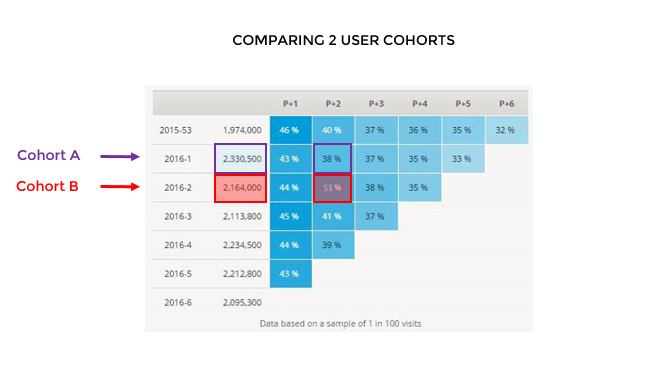
Even if the absolute number of Cohort A users (those who first launched the app in Week 1) is higher, fewer of them came back later, compared to users from Cohort B. If we look at the week P+2, we see that 53% of Cohort B users came back to use the application, whereas only 38% of Cohort A users came back.
Why does the graph have this upside-down stairs shape?
Each week (or each day, depending on the selected granularity), a new user cohort is analysed. As time progresses (the more recent the cohort is), the remaining analysis period automatically decreases, giving this graph the inverted stairway shape.
Digital analytics tools, such as AT Internet’s app analytics dashboards, allow you to create your own graphs for retention analysis. To learn more, watch our video about retention matrices.
Want to know more about analytics for mobile in general? Download our free Guide to Mobile App Analytics